George Nelson: An Exhibition
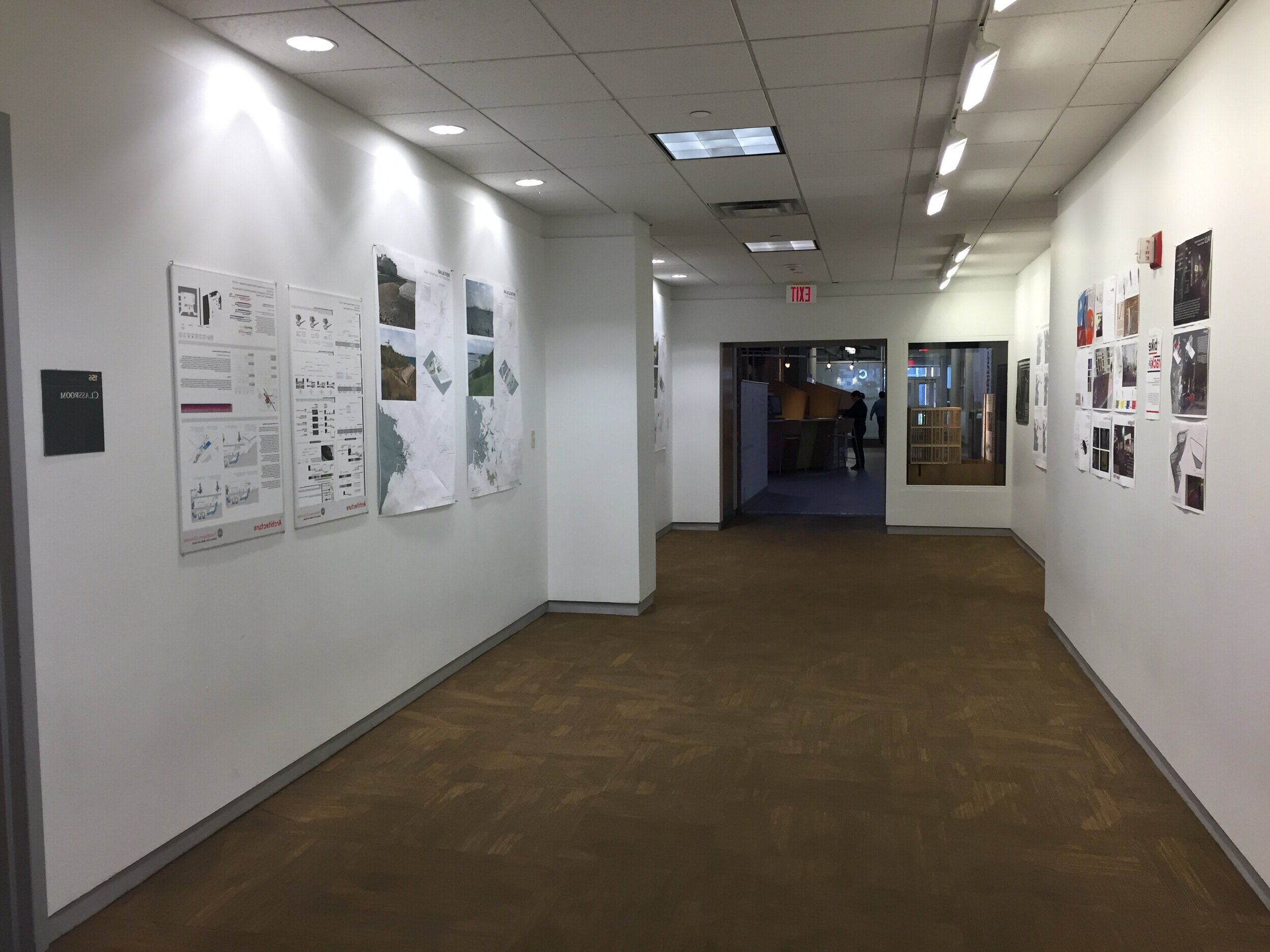
This exhibition was a culmination of my two fields of study: Architecture + Graphic & Information Design. The space was designed around an highly-trafficked and under-designed threshold that can be found in the art building at Northeastern University. Problem: How can you create an exhibition space to showcase the work of George Nelson?
The exhibition was inspired by the life and work of George Nelson, an exceptionally talented and hardworking designer whose work flourished throughout the mid 1900s. I was particularly attracted to Nelson’s ability to have such varied accomplishments and wanted to showcase those in a timeline organization as students and faculty experienced the space. Scroll to see my process.

Research
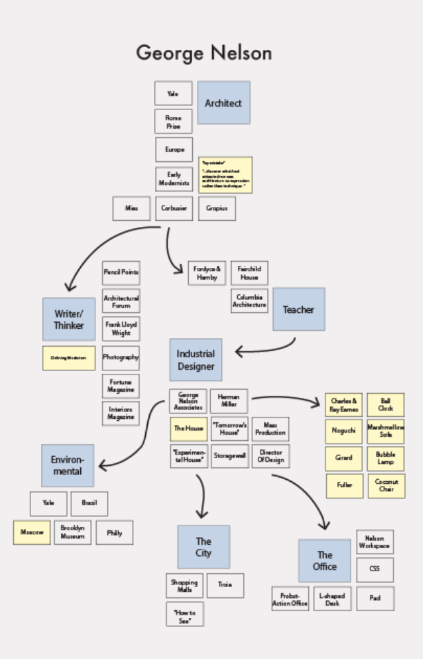
The initial work involved extensive research around the life and work of George Nelson. I was also focused on what direction and/or theme to run with. With the help of my mentor, I was able to solidify the concept of a timeline, which lended itself to the nature of the space.
Choose the Space
I initially struggled with designing a traveling exhibition, belonging to various museums. So, with the help of my professors, I was able to narrow down an actual space that I could visit and visualize my designs. The corridor I picked belonged to the Northeastern campus. It was mostly made up of white walls, however, these “bump outs” made for an interrupted wall space. I chose to use those bump outs as an organizational tool to detail Nelson’s life events.


Sketching
A series of hand-drawings detailing concept tests and overall organization of the space. I used trace paper to layer drawings on top of one another and see how the diagrams could work on multiple levels.
Typography
The typography for this project is Futura, Futura Light and Futura Bold. The sans serif is simple, but has character. It pairs nicely with the simplicity of Nelson’s designs and overall look and feel of the exhibition.
Quick typography renderings.
Another iteration of testing type renderings.
Poster Exercise
Testing drawing styles, typography and overall concepts of the exhibition to be carried throughout the space. Playing with color, shadow, line weights, strokes, etc.
Architectural Drawings
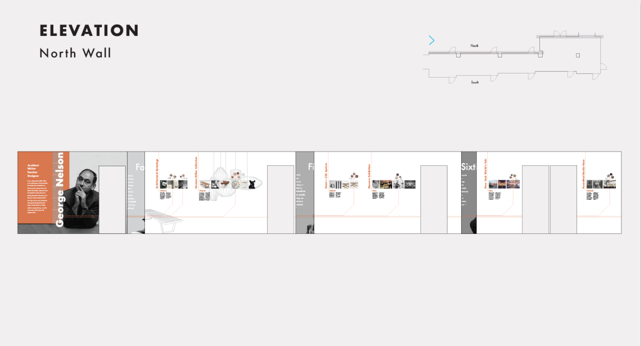
It became clear to me that to be communicate this project, I would have to use a series of architectural drawings and diagrams in order to best represent the ideas behind the exhibition. The following images are a series of drawings and diagrams.
Rough Model Photos
I created two small scale model out of cardboard to test out the graphics and typography within the space. I was also testing to see how the placement of images and information looked.


Final Model Photos
The final model was made from white foam core to make for a sleek, final look. All edits are included in this final iteration.


Take-Away
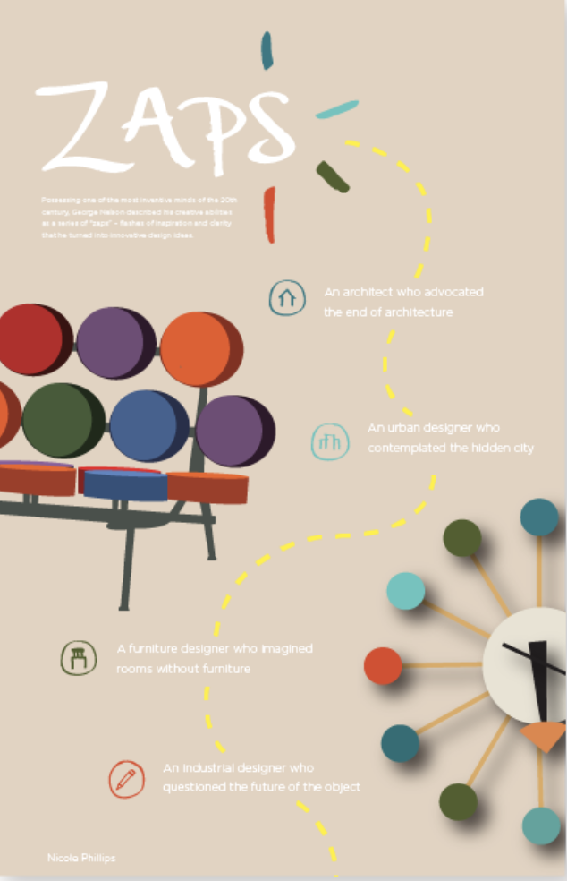
The take-away was created for users to grab on their way in or out of the space. It is intended to give more context of George Nelson’s life and work to those who seek it.
Virtual Reality
I was fortunate enough to be one of the first Northeastern students to use the school’s new VR goggles. Using sketch-up, I was able to place my designs onto the walls of the model I build to scale. From there, the goggles allow you to put the model in scale in real time and “walk through the space”. Users were able to experience my designs as they walked down the actual physical corridor I redesigned.


