Zing: Hot Sauce Platform
This work was completed in three months. Within that time, I was able to do market research, develop personas and product features, create storyboards, make low-fidelity prototypes, complete usability tests, develop UI and branding, as well as create a polished clickable prototype. This primarily mobile application was inspired by Kayak, Yelp, and Vivino. It is a mobile platform for discovering, documenting, and sharing hot sauces. Problem: How do you create a platform that is beneficial, enjoyable and delightful for a community of hot sauce enthusiasts? Scroll to see my process.

Problem
The challenge was to create a hot sauce platform that enables discovery of new and exciting hot sauces, the ability to document hot sauces in a personal library, and also to share hot sauce experiences with a community.
Roles & Goals
I went through a couple of exercises to try and understand who my users would be and what goals they had when using the platform. Ultimately I found that the two main groups of users would be the Sharer and the Sear
Users
The intended audience and users are mobile-minded. They are typically in their mid-twenties and use their phone for most things in their life. The users are hot sauce enthusiasts through and through.
Storyboarding
My storyboarding process was creating different scenarios where users would utilize Zing to complete their task and make their lives easier. The following are three storyboarding scenarios.
Elevator Pitch
A quick summary of what the application is all about. Intended to be short and sweet. By telling someone this statement, they should have a good idea of what your app is capable of and if they would be interested in using it.
Prototype
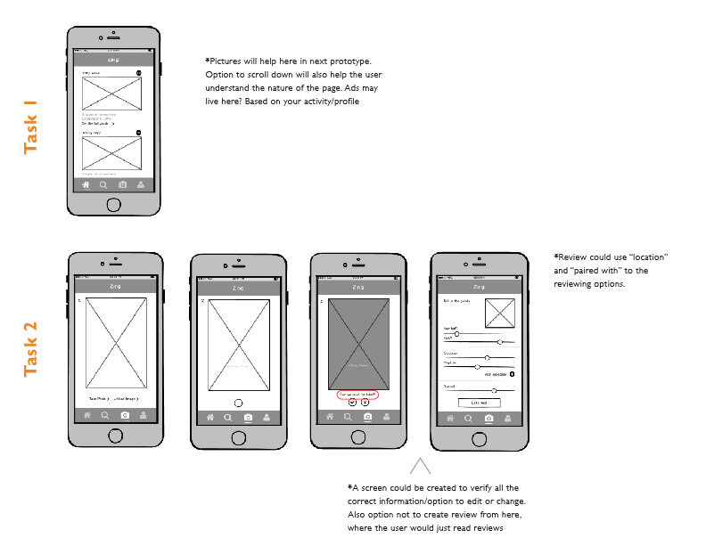
Low fidelity prototypes made by using Balsamiq. The purpose of these prototypes was to get an understanding of basic navigation and features. A few usability tests followed the creation of these prototypes. The tasks and feedback from the users are shown below.
User Feedback + Summary
After testing the prototypes, I gathered all user feedback and created a summary of notes. From this, I was able to make significant changes to the application in order to make for a better user experience and meet the needs of the user.
Logotype
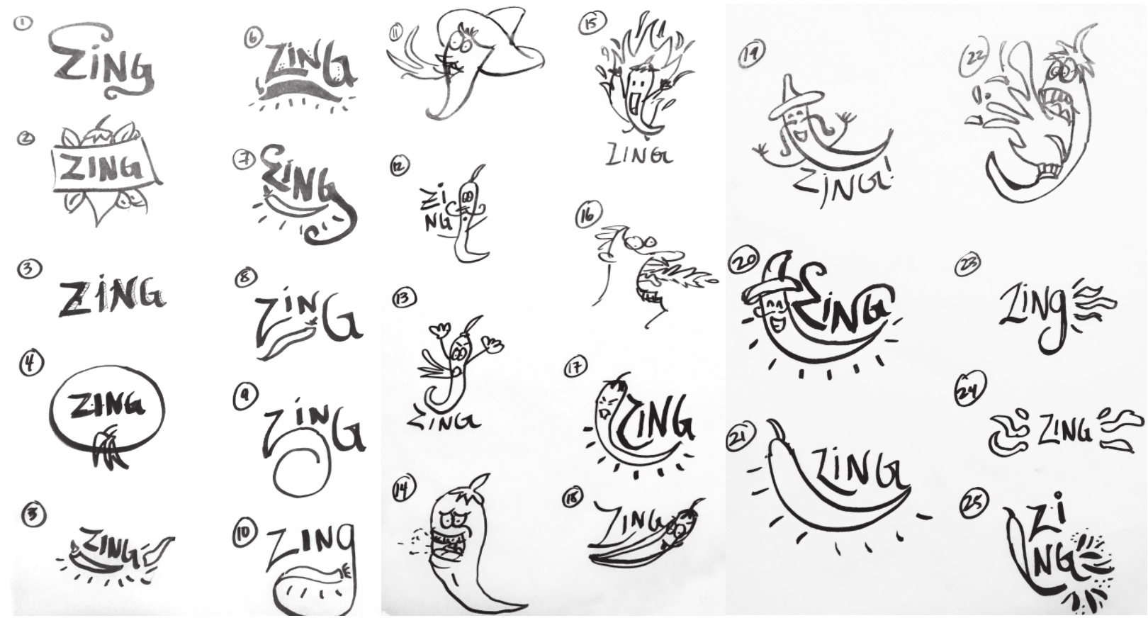
My logotype creation process began with many trace paper sketches with a sharpie. It then moved to digital design, where I got attached to the pepper character. He reminded me of the paperclip character found in older versions of Microsoft Word. The final series of logos incorporates my various illustrations styles and selected color palette for Zing.
Style Guide
It all begins with an idea. Maybe you want to launch a business. Maybe you want to turn a hobby into something more. Or maybe you have a creative project to share with the world. Whatever it is, the way you tell your story online can make all the difference.
UI Rounds
I had trouble nailing down an illustration style that was a balance between adding some fun and delight to the app but also making sure not to overcomplicate the already text-heavy screens. Other things I was testing: color and contrast, color palette, button style, text hierarchy, line weights and white space.
Final UI/UX
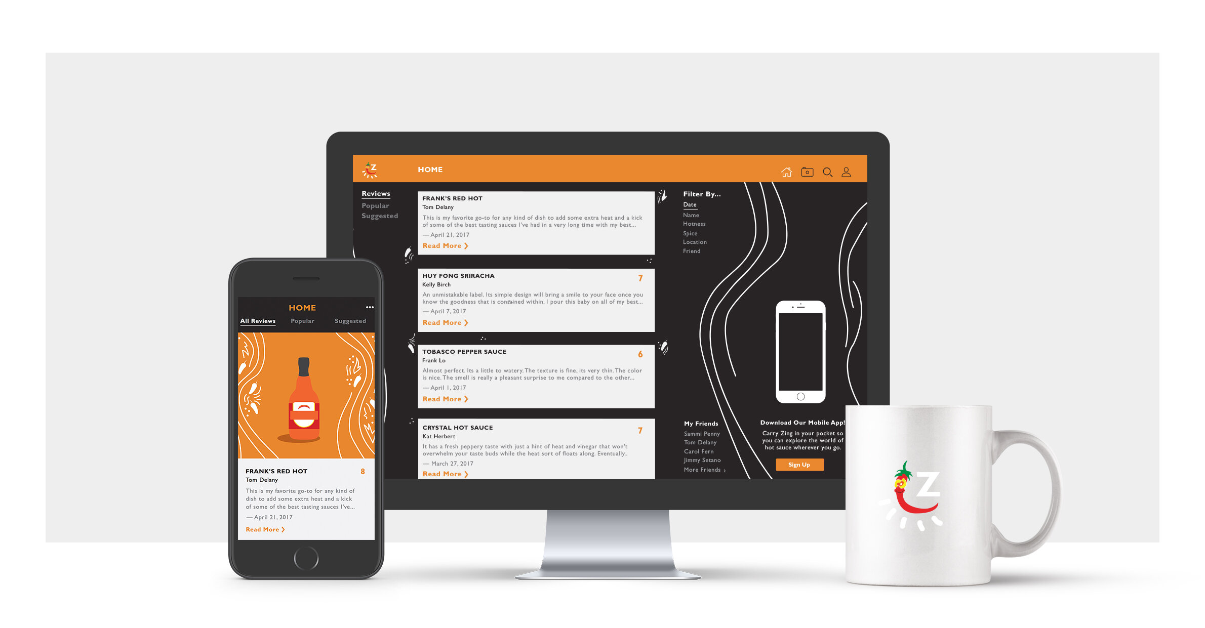
The final UI/UX design deliverables included a happy flow through the app. The final UX included all the changes and feedback gathered in user testing. The final UI included changes made from feedback from my peers, most of which encouraged going simpler with drawing styles + text and adding more white space to just about everything. Below are a few samples of the final product.

Learn More
Have a look at the final prototype by clicking on the button below. Your experience will be guided by a circular hot spot. Please follow the hot spot to experience the designed flow.


